Serious luxury can still be joyful. In our latest home tour, recently featured in AD Middle East, we invited colour, texture and personality to the fore. Rooted in soothing blues, this townhouse springs to life with playful contrasts, tactile details and a calm exuberance that balances elegance with everyday delight. Dive below to explore how we turned tone into emotion, and space into a story.
In Quiet Hues of Blue – with a playful twist
There is something inherently grounding about the colour blue. But in this home, it does more than simply calm, it also invites smile-lines, easy movement and a sense of delight. In our recently completedMarylebone Townhouse, we treated blue not as a mere backdrop, but as the thread that ties together joy, tranquillity and lived-in elegance.
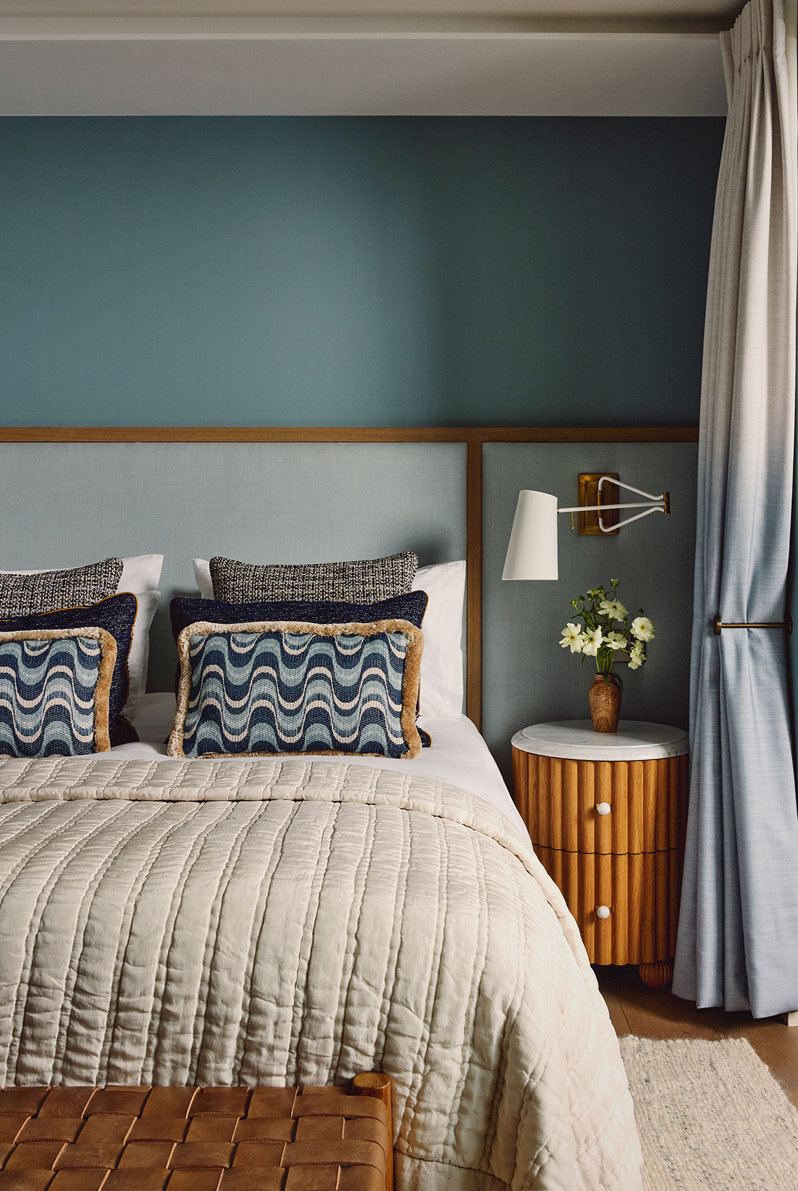
Rather than turning to bold, saturated or theatrical shades, we explored paired-back hues, tones that are cool and laid-back, yet quietly complex. They feel like reflections of the sky, or morning light over water. And crucially, they have a personality: calm, confident and perfectly at ease
A Dialogue Between Colour, Material and Joy
Throughout the home, blue becomes less of a colour and more of a feeling. It anchors the interiors with an unmistakable presence, bringing clarity and spaciousness. Each space was designed to be a visual exhale: a place that encourages movement, openness, and ease.
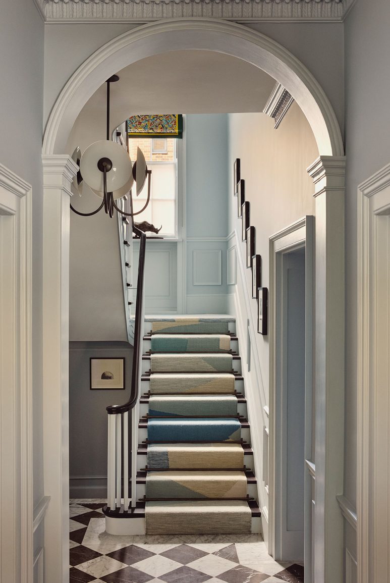
From the moment you step inside, the tone is set. In the entrance hall, a chequered board floor meets softly painted blue walls; above it a lively runner by Peter Page in shifting shades of blue makes a statement that is bold and understated. The moment invites fun, hints at eclecticism, and instantly lets you know this is a home that embraces life.
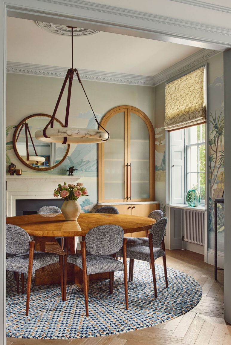
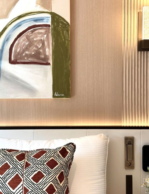
Our approach to texture was deeply tactile. We layered surfaces to invite touch: a hand-painted mural by Fromental brings artful whimsy, while raffia grass-cloth walling and rattan panelling invite the hand. These are surfaces you don’t just see – they feel and add soul.
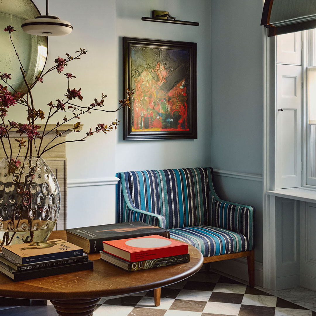
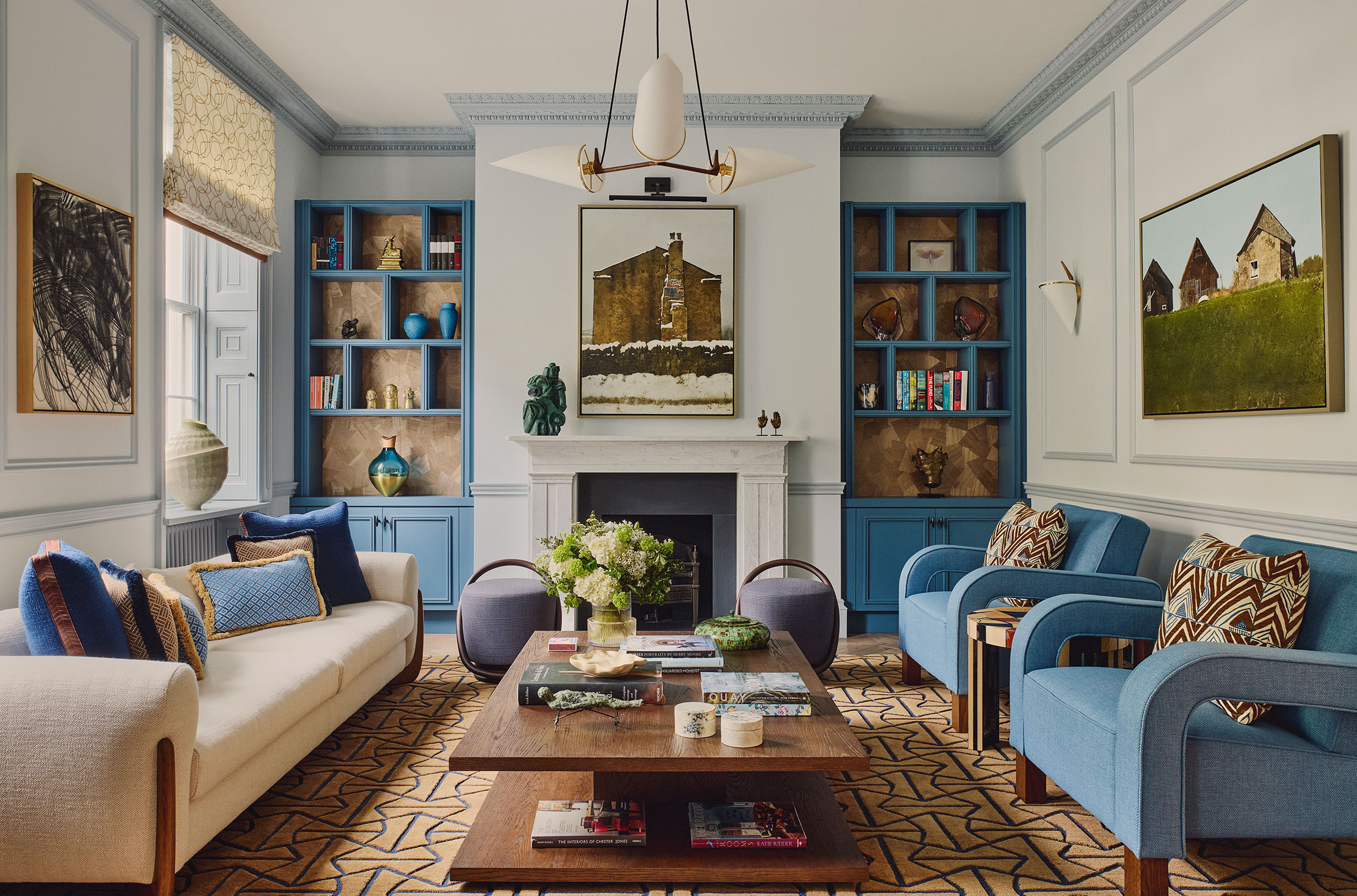
In the drawing room, deeper tobacco hues ground the palette, introducing warmth and sophistication. The pairing of blue and brown evokes timeless elegance – a contemporary nod to heritage interiors that the architecture naturally suggested.
Upstairs, the mood softens in the primary bedroom, drifting towards serenity. Here, soft aquas and misty tones lull the senses into calm and quiet reflection.
Rooted in Nature’s Palette – infused with happiness
Blue’s capacity to bring calm is well known, but combined with woods, greens, terracotta, clay or ochre, it becomes truly joyous. In this home, natural elements were woven in to forge a space that is both joyful and soulful: interiors that feel alive, layered and deeply personal.
The lower-ground games room embraces this spirit with vibrant contrast: sunshine yellow cabinetry and cobalt accents create an unexpected burst of fun, reminding us that sophistication and playfulness can coexist beautifully.
A Space for Life, Not Just Display
This home was designed for real living. Rooms flow effortlessly into one another; furniture, some mid-century and some bespoke, was chosen for comfort, story and soul. Every piece, every hue and every finish reflects a belief that design should serve emotion as much as form.
Here, blue becomes a feeling – a quiet rhythm through the home that calms, uplifts and connects. It’s a reminder that the most beautiful spaces aren’t just seen; they’re felt.
This website uses cookies so that we can provide you with the best user experience possible. Cookie information is stored in your browser and performs functions such as recognising you when you return to our website and helping our team to understand which sections of the website you find most interesting and useful.
Strictly Necessary Cookies
Strictly Necessary Cookie should be enabled at all times so that we can save your preferences for cookie settings.
If you disable this cookie, we will not be able to save your preferences. This means that every time you visit this website you will need to enable or disable cookies again.
3rd Party Cookies
This website uses Google Analytics to collect anonymous information such as the number of visitors to the site, and the most popular pages.
Keeping this cookie enabled helps us to improve our website.
Please enable Strictly Necessary Cookies first so that we can save your preferences!